ATARODO
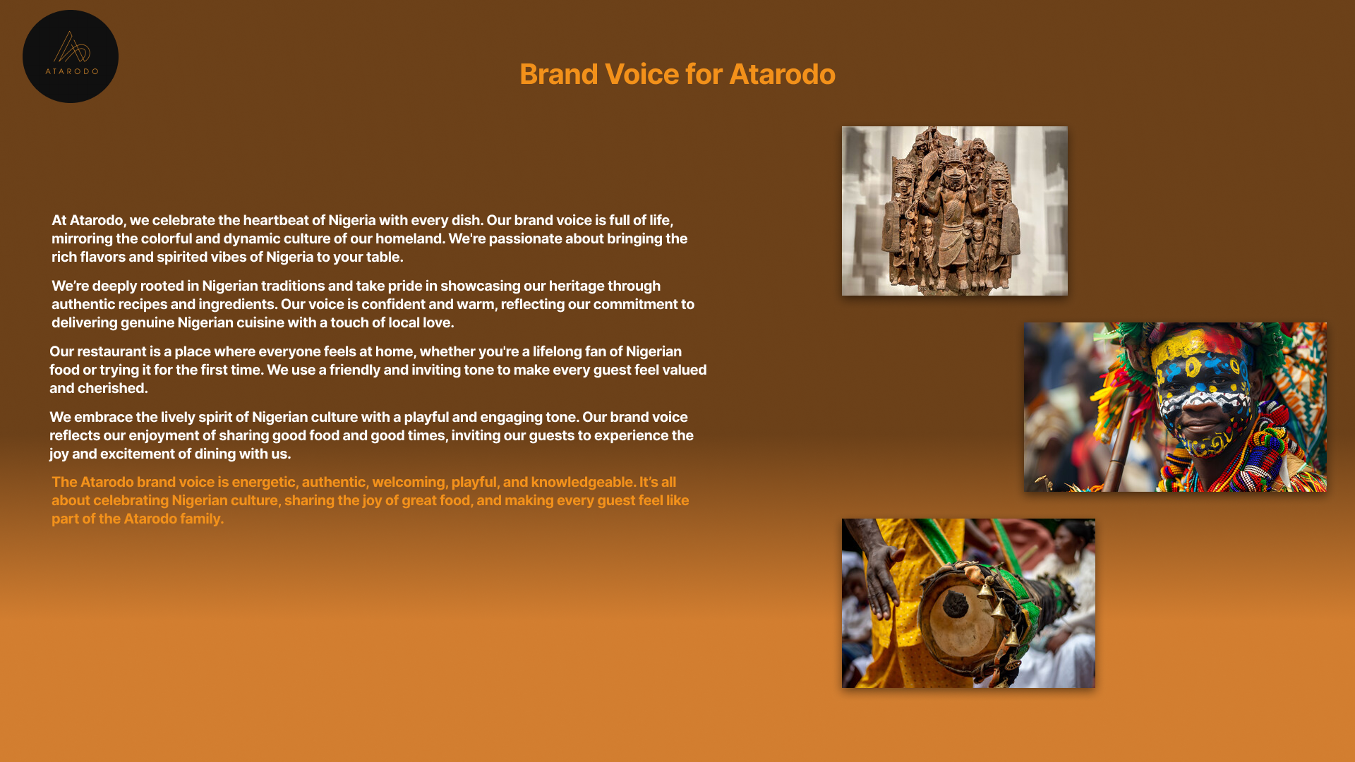
‘ATARODO’ is rooted in Nigerian traditions and takes pride in showcasing the heritage through authentic recipes and ingredients delivering genuine Nigerian cuisine with a touch of local love.
MY ROLE
DELIVERABLE
Design lead
High Fidelity Design
UX researcher
User research
OVERVIEW
The primary purpose of developing a mobile website for Atarodo is to enhance the overall customer experience and drive business growth through a streamlined, user-friendly online presence tailored specifically for mobile devices.
UI/UX Designer
Enhance Accessibility and Convenience:
24/7 Access: Provide customers with the ability to access Atarodo’s menu, restaurant information anytime and anywhere from their mobile devices.
Ease of Navigation: Simplify the process for users to find essential information quickly, such as location, hours of operation, and contact details.
USER INTERVIEWS
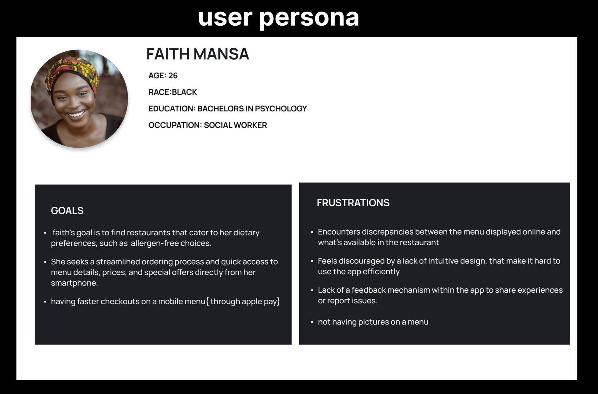
PERSONA
Purpose of Creating a Mobile Website for Atarodo
Showcase Atarodo’s Unique Identity:
Cultural Representation: Reflect Nigerian cultural elements in the design and content of the website to create an authentic and appealing experience that resonates with both local and international customers.
Visual Appeal: Highlight Atarodo’s unique offerings, including traditional Nigerian dishes and restaurant ambiance, through high-quality images and engaging content.
Developed a semi-structured interview guide with questions covering user needs, frustrations, and desired features for a restaurant’s mobile website.
Sample questions included: “What do you find most frustrating about mobile restaurant websites?” and “What features would make it easier for you to place an order online?”
KEY FINDINGS
Navigation: Users preferred a straightforward, easy-to-navigate menu with clear categories and search functionality.
Online Ordering: A smooth, intuitive ordering process with minimal steps was crucial.
Improve Operational Efficiency:
Integrated Systems: Develop a mobile platform that integrates seamlessly with existing restaurant management systems for orders, reservations, and customer relationship management.
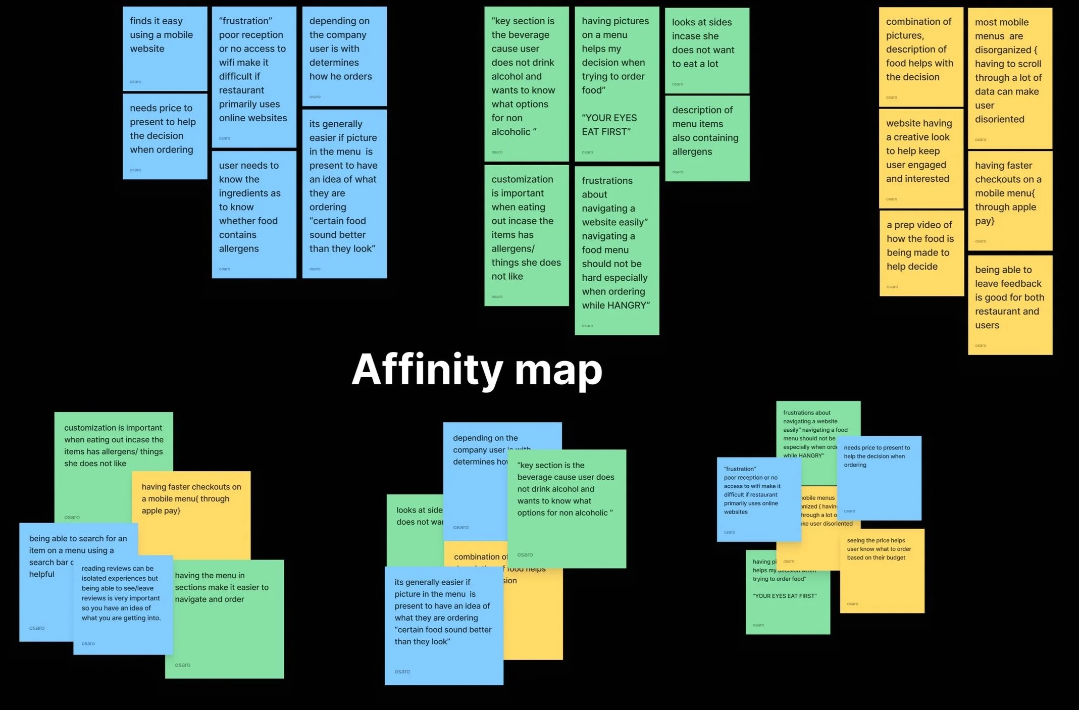
Personas were created to represent the diverse user groups that participated in the interview process. They helped in understanding user needs, behaviours and goals by providing a concrete and relatable profile for different segments of the user base. This facilitated making informed design decisions that are aligned with actual user needs rather than assumptions.
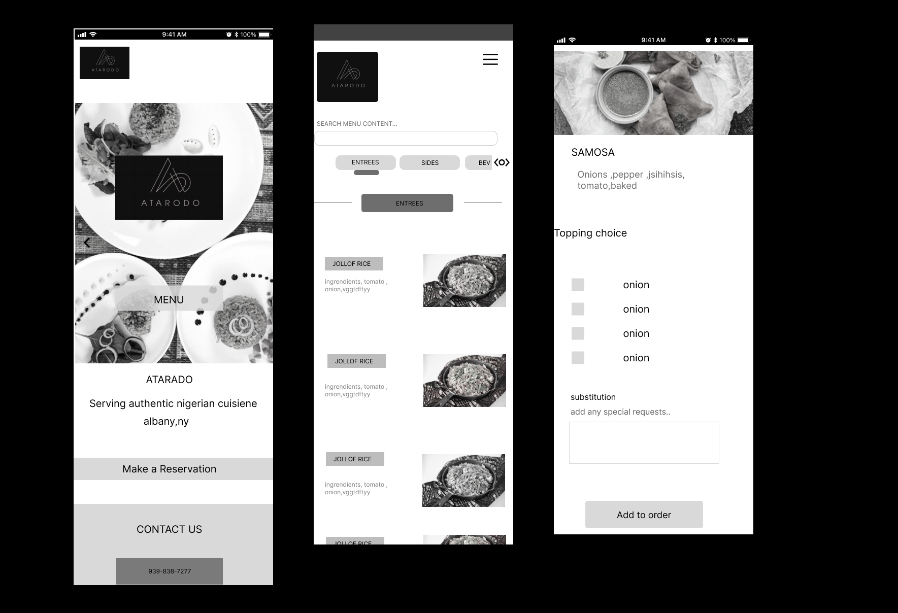
WIREFRAMING
KEY FINDINGS FROM THE USABILITY TESTING
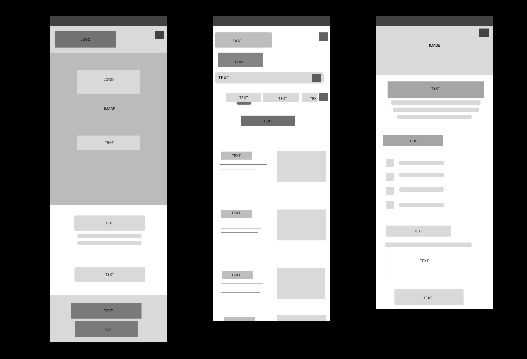
Issue 1: Users reported that the design was cluttered, with too many images and colors competing for attention.
THE PROBLEM
What are the key problems you want to solve
Problem Statement
OUR USER IS
is a young digital native
WHO NEEDS
a/an intuitive, hassle-free interactive mobile/online menu
IN ORDER TO
to make ordering food a less frustrating and protracted experience
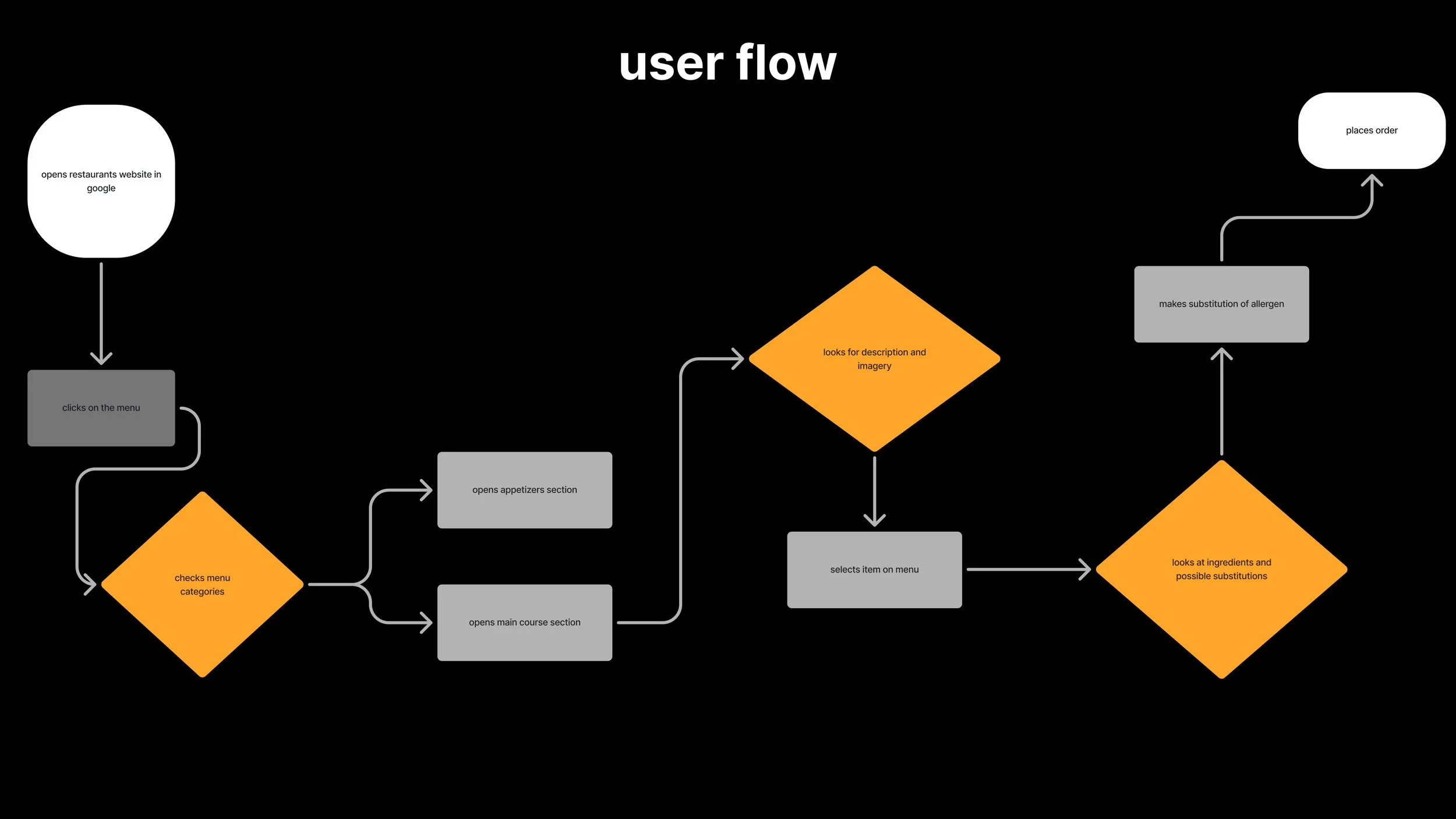
user flows helped us design an intuitive and efficient navigation experience tailored to the needs of the users
The goal was to ensure that users could easily navigate through the site to find information and complete tasks relevant to their needs
The flow starts with the user landing on the homepage, then navigating to the product category page, selecting a product, adding it to the cart, and finally proceeding to checkout. Each step is designed to be intuitive and straightforward.”
Initial iteration and layout of what the website could look like based on user data collected during the affinity mapping process.
USANILITY TESTING
first round of the mid-fidelity wireframes with placeholders showing what the website would look like based on the user data and problem statement
Issue 2: Users felt overwhelmed by the amount of information presented at once.
changes were made based on the feedback from the usability testing and user data
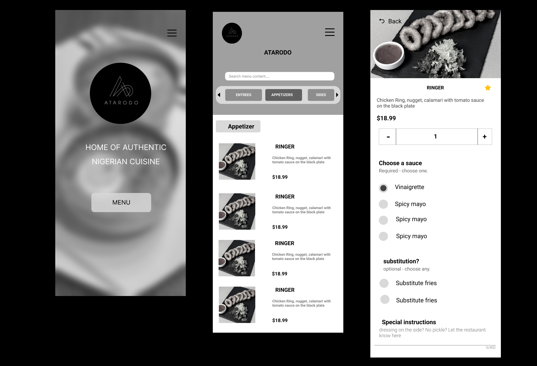
FINAL ROUND OF USABILITY TESTING
The final round of usability testing confirmed that the high-fidelity wireframes effectively meet users needs while reflecting the brands identity.
By addressing the identified improvements, the website can enhance user satisfaction and drive engagement, ultimately leading to increased patronage and online orders.
By connecting branding guidelines with user research and strategic wireframing, the final design for the nigerian mobile website effectively communicates the brands identity while proving an intuitive user experience.
this demonstrates a structured approach to merging branding with functional design in a culturally relevant context.
Conclusion
The redesign of Atarodo's mobile website has significantly transformed the user experience, making it more engaging and reflective of the vibrant nature of Nigerian cuisine. By addressing key pain points such as navigation and visual appeal, the project achieved a notable increase in user engagement and received positive feedback from users.
Throughout the project, I gained valuable insights into designing for cultural contexts and overcoming technical challenges related to mobile optimization. This experience has enhanced my skills in creating culturally resonant and user-centric designs.
Moving forward, integrating user feedback mechanisms into the website will be a valuable next step, ensuring that the design continues to evolve based on user needs. I look forward to applying the lessons learned from this project to future endeavours and continuing to explore ways to enrich user experiences.
Reason for Change: A minimalist approach with a clean layout can help direct focus to important content, such as menu items and specials, improving overall readability.
Reason for Change: A minimalist approach with a clean layout can help direct focus to important content, such as menu items and specials, improving overall readability.
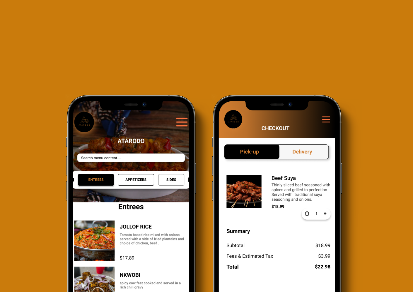
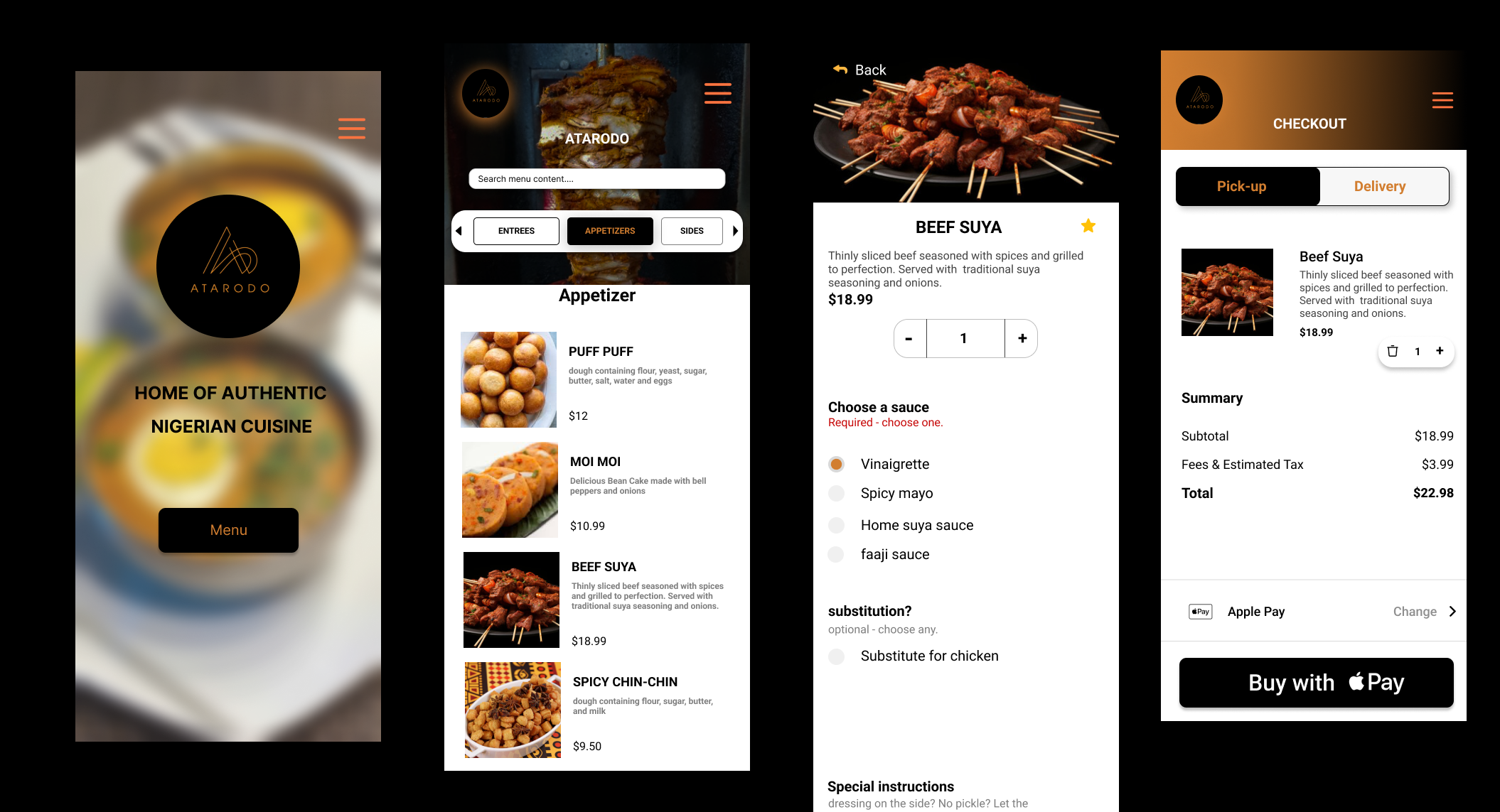
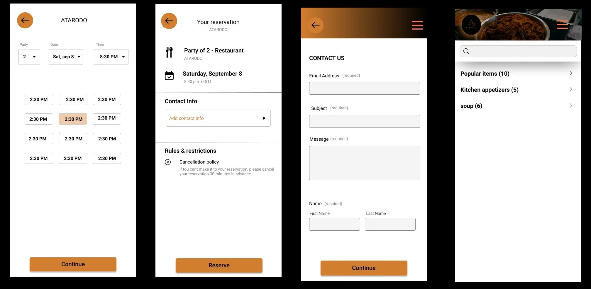
HIGH FIDELITY WIREFRAMES
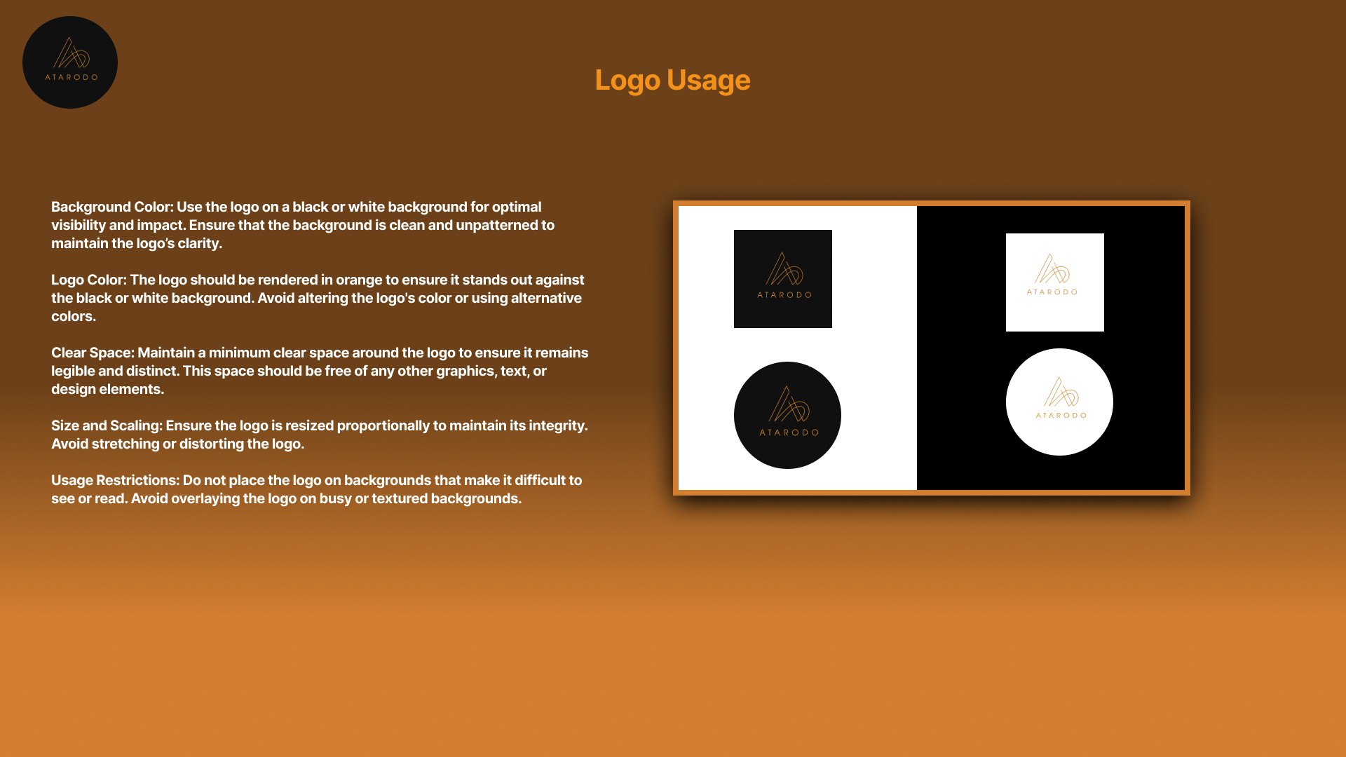
Before going into the hi-fi wireframes , Creating branding guidelines prior to high-fidelity wireframes sets a solid foundation for design and ensures that the final product aligns with the brand’s identity and goals.
final wireframe designs for ATARODO